
background
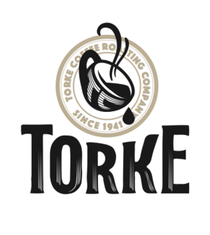
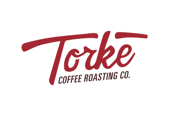
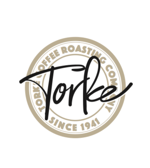
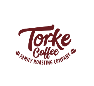
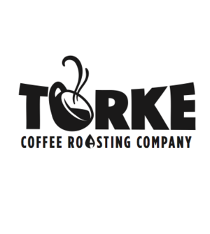
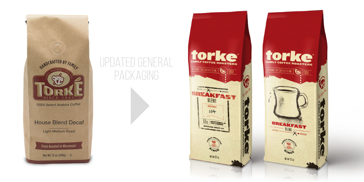
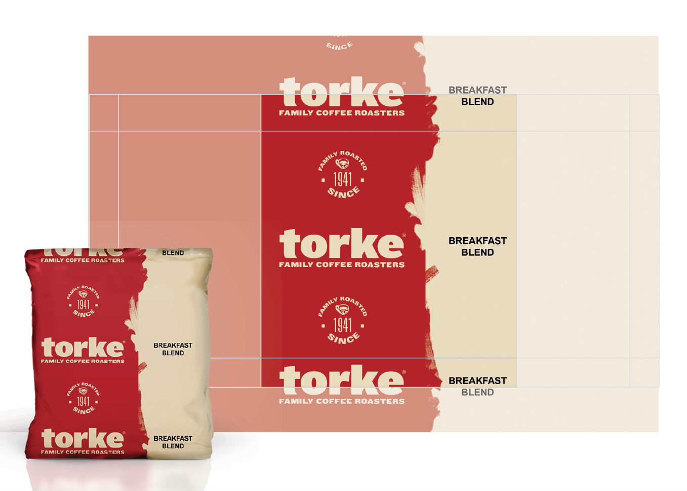
Toke Coffee came to Jacobson Rost for a brand refresh and a packaging overhaul. With ambitions of moving to a more consumer-based appeal, the task was set to brighten and refresh a historical local business that has a rich family history. With a mission to be more approachable and competitive in a crowded craft coffee market, a visual solution was needed to make the brand stand out.
mission
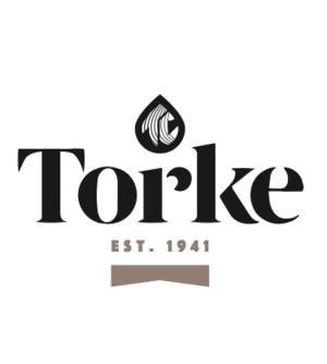
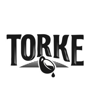
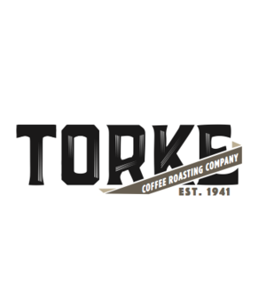
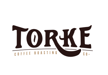
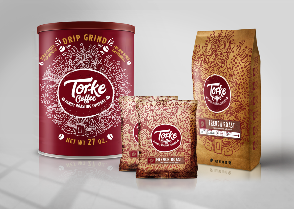
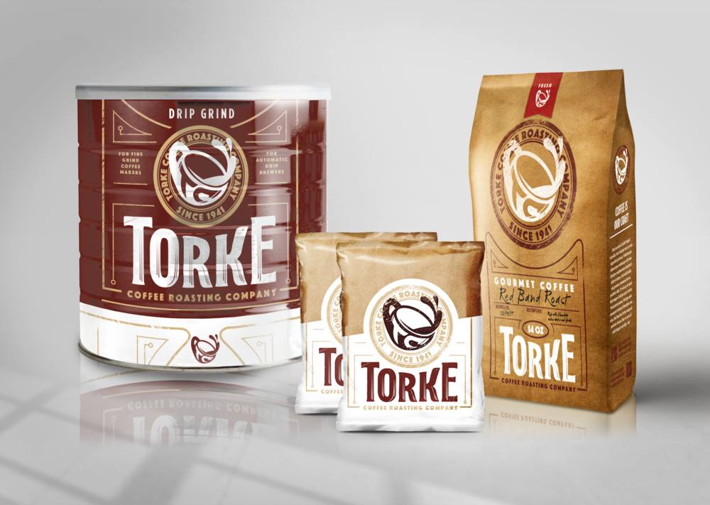
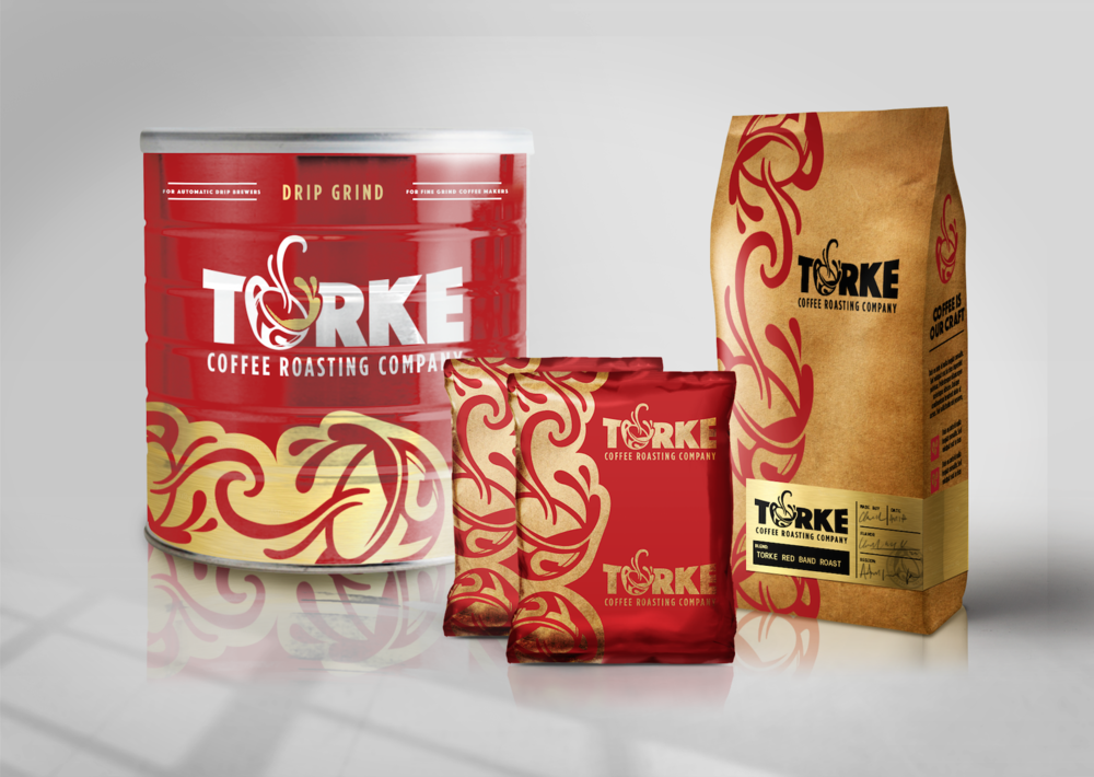
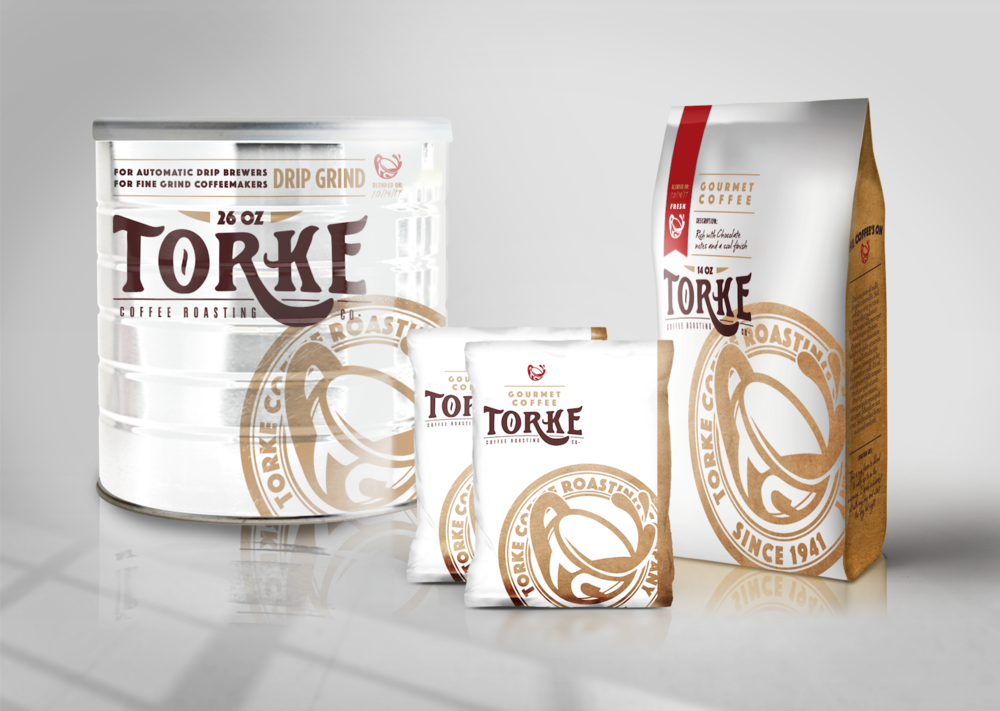
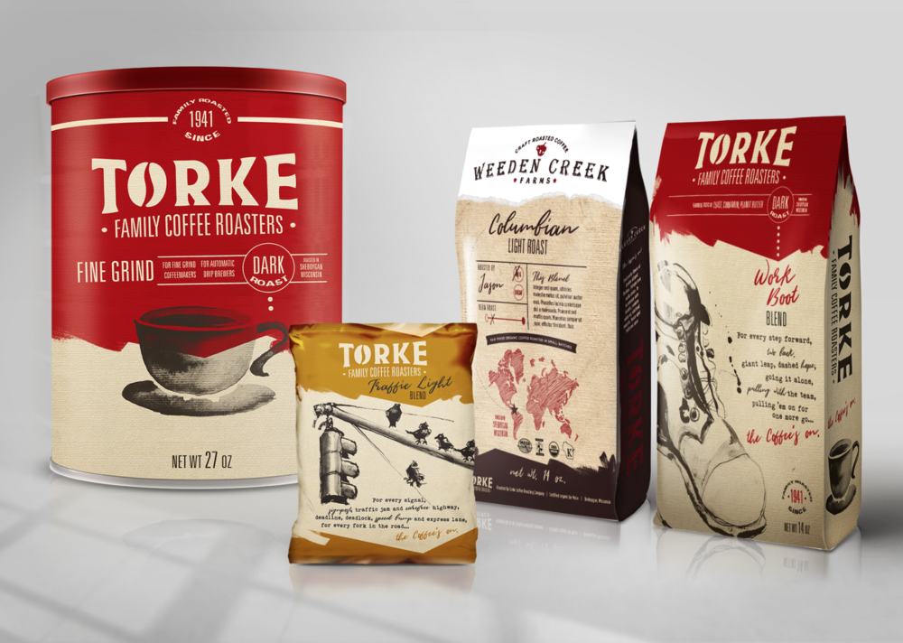
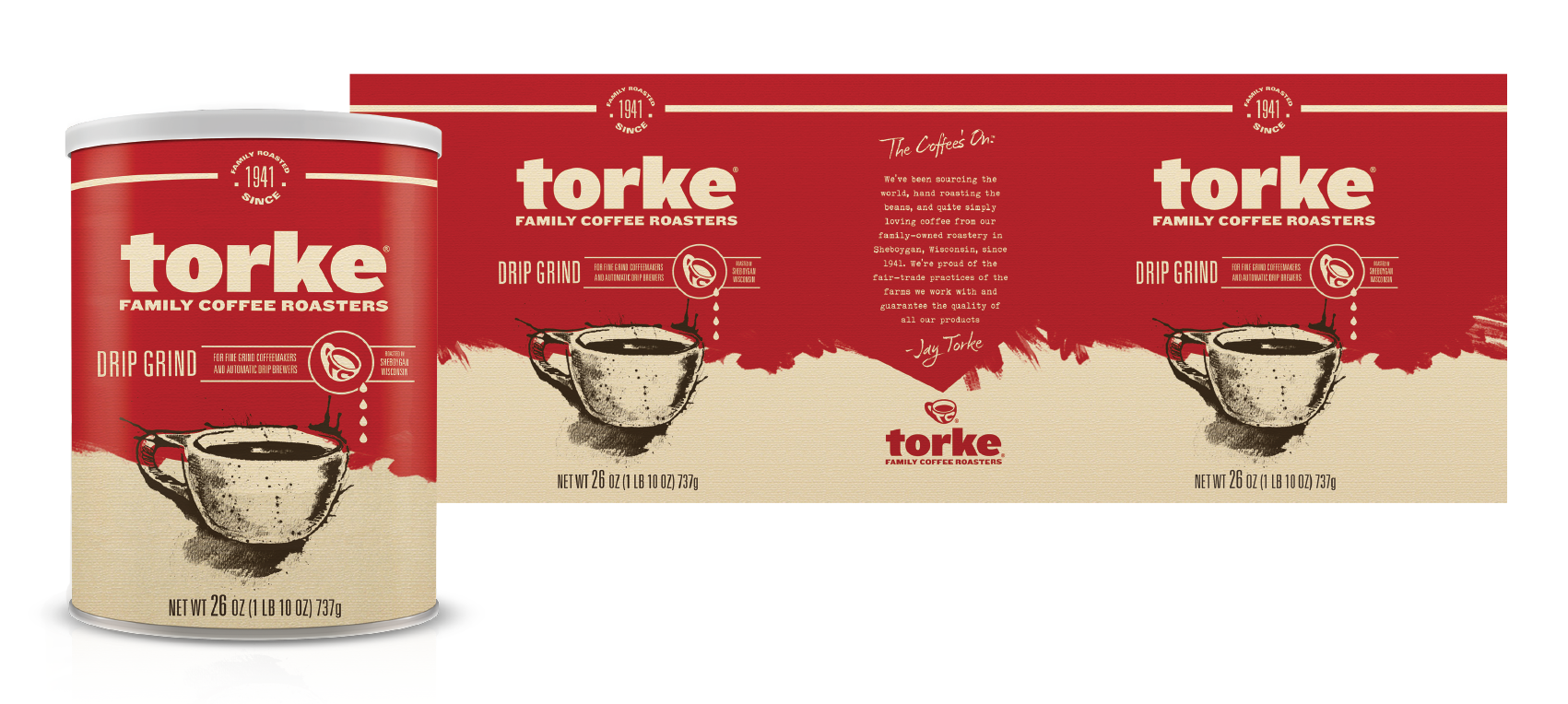
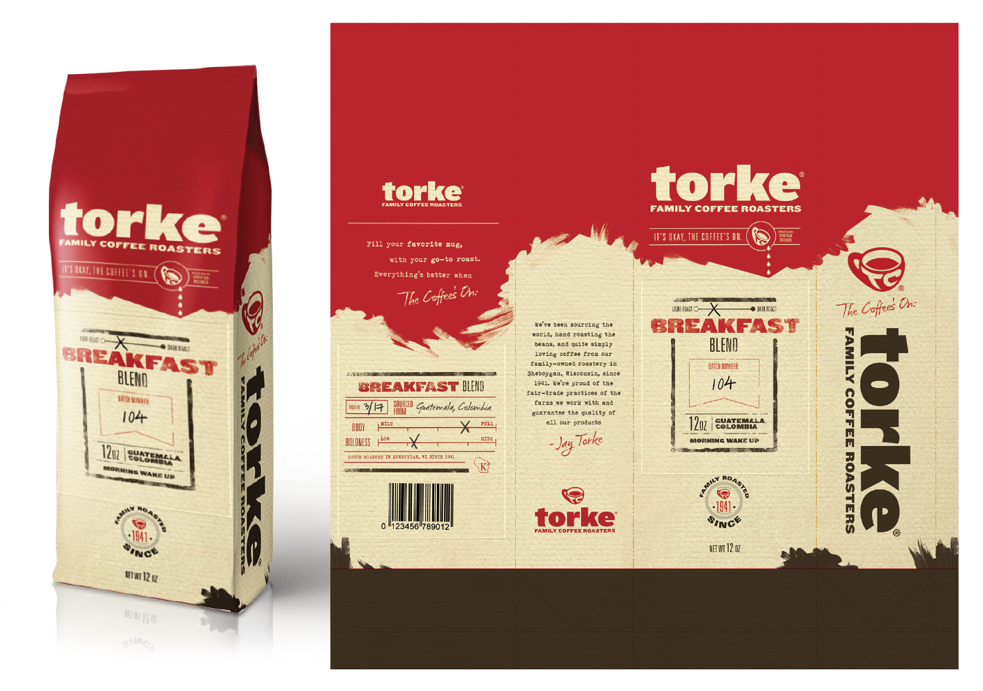
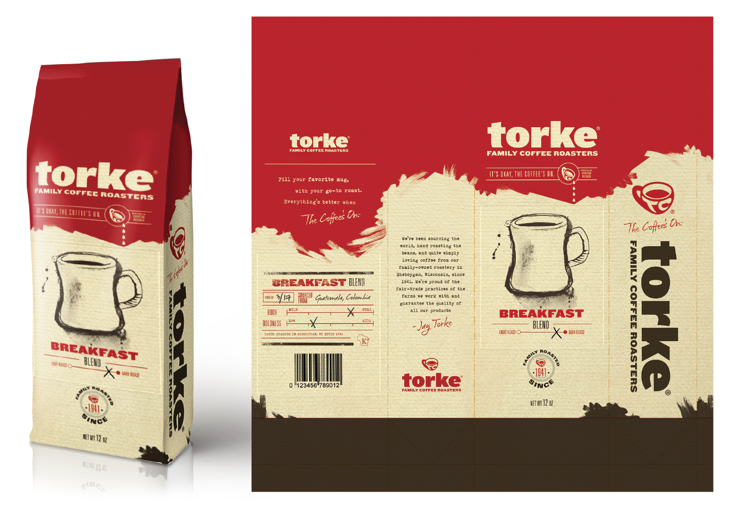
With an updated monogrammed cup and clean bold typography, the new direction was sure to make a splash. The gritty hand-crafted appeal felt rooted deep in story and history. The new approach became a narrative and illustrative execution taking Torke Coffee to new heights of visual appeal.
Agency: Jacobson Rost
Brand Identity
Packaging Design
Custom Illustration
Campaign Development
Design Pitch
• Art Direction
Logo Development
Proposal and Implementation

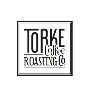
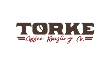
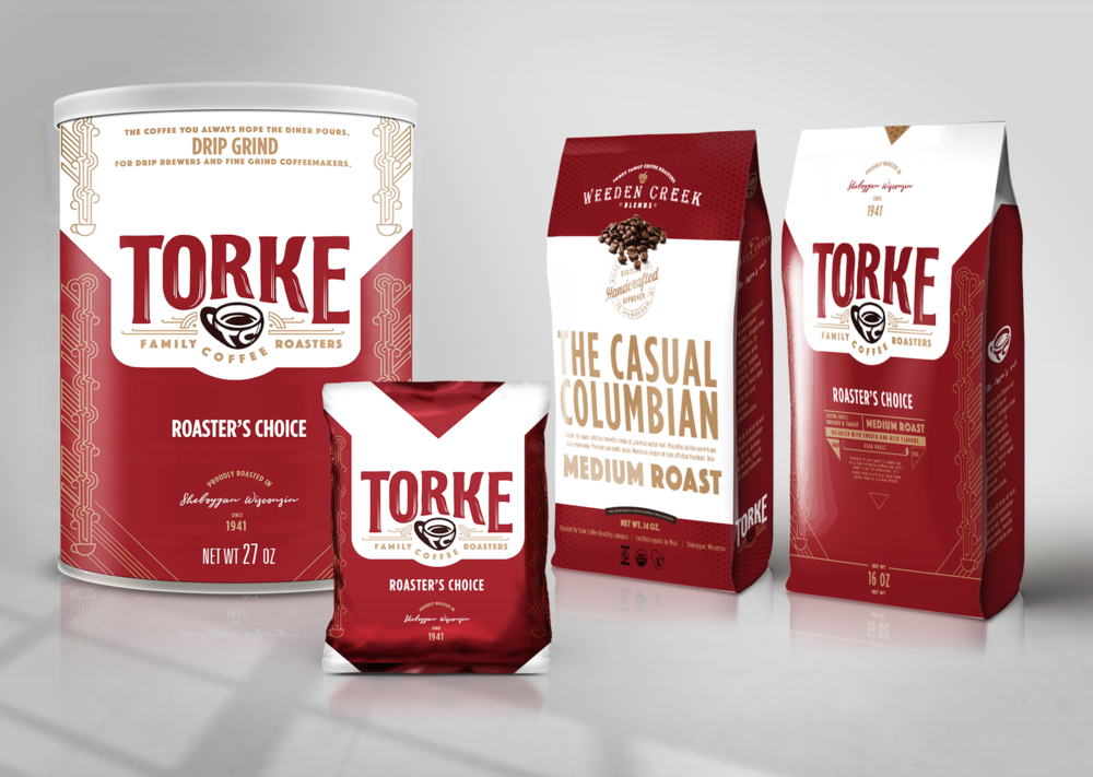
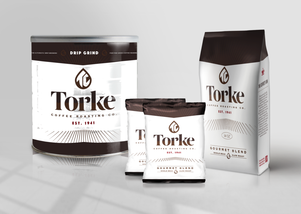
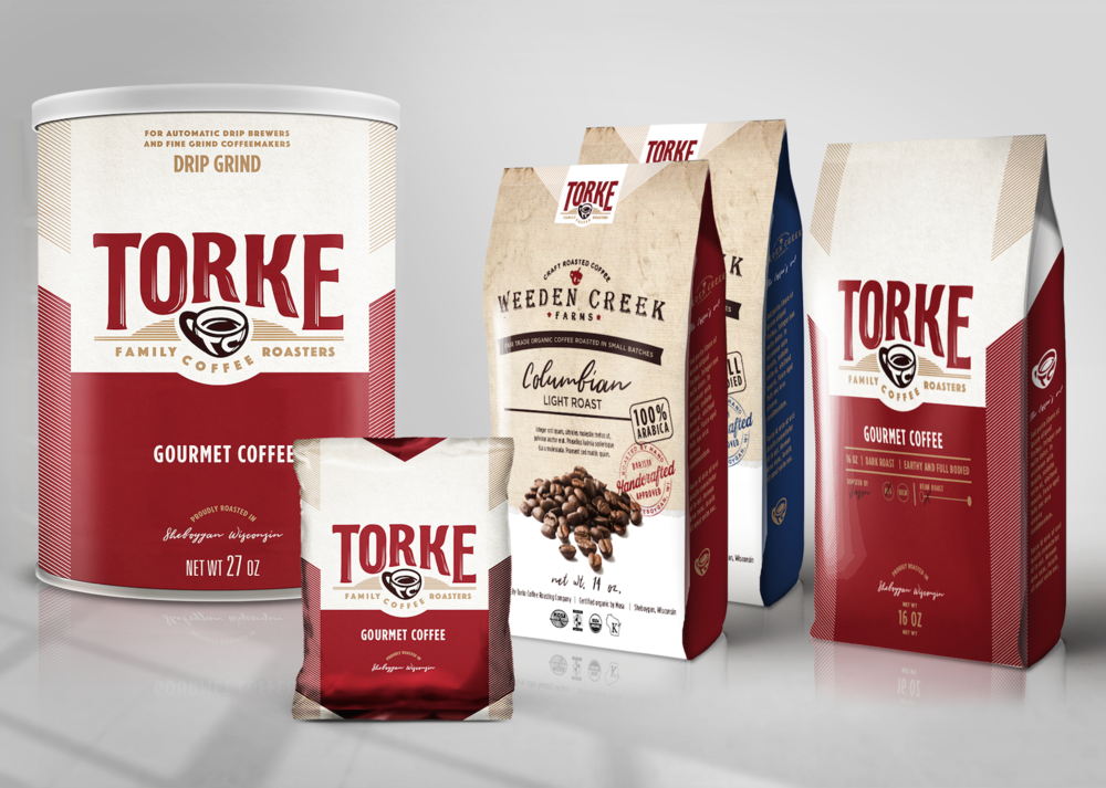
Logo Concept Explorations
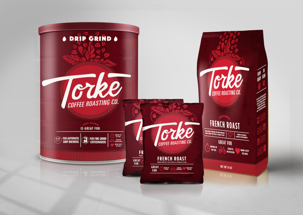
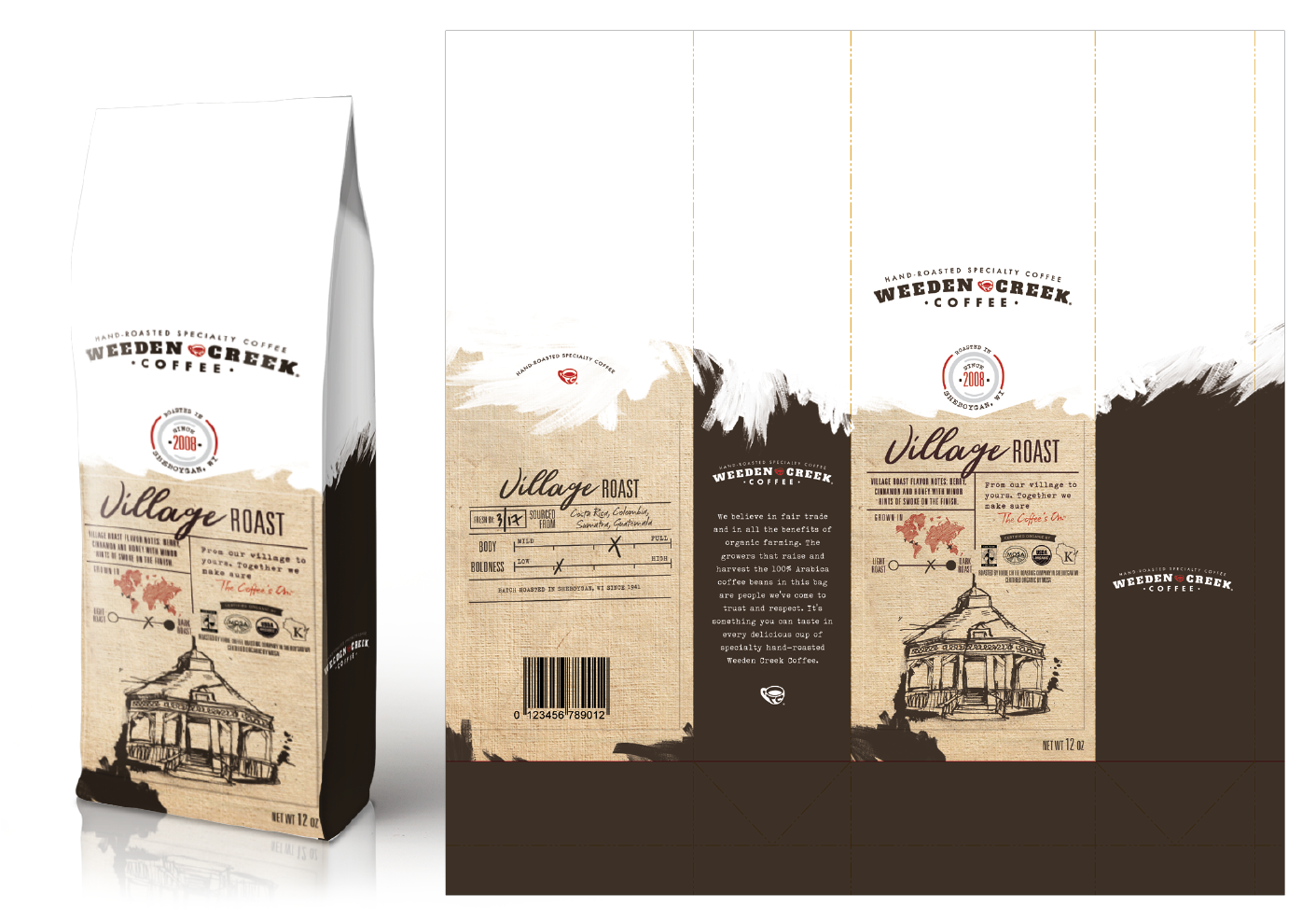
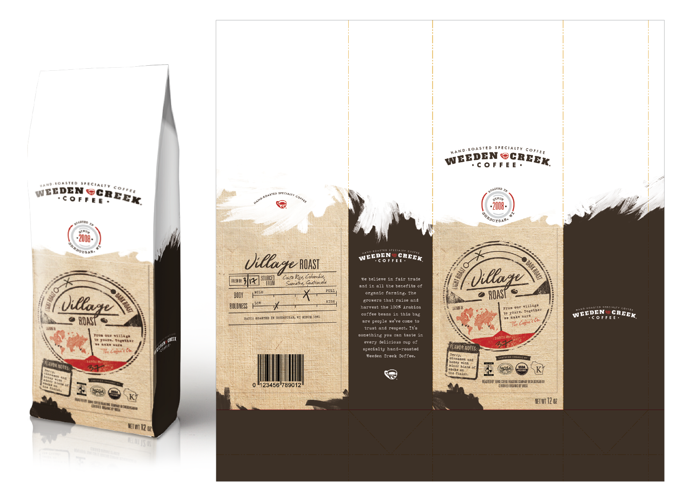
Packaging Line-up

Packaging Concepts
“We wanted something fresh that told a story for every sip”
Darren | december 2017


Final Key-Lined Packages
wanna see more?
Check em out
